
HISTORICA CANADA
THE CANADIAN ENCYCLOPEDIA
MY INPUT
Customer Interviews • Search Strategy • Analytics & Data Tracking • Research • Wireframing & Prototyping • User Experience • Product Iteration • Mobile Deployment

PLANNING & RESEARCH

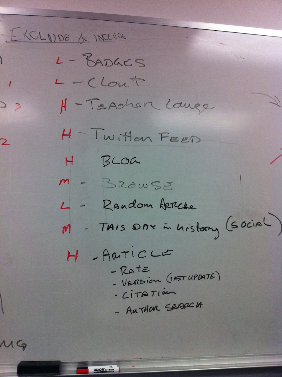
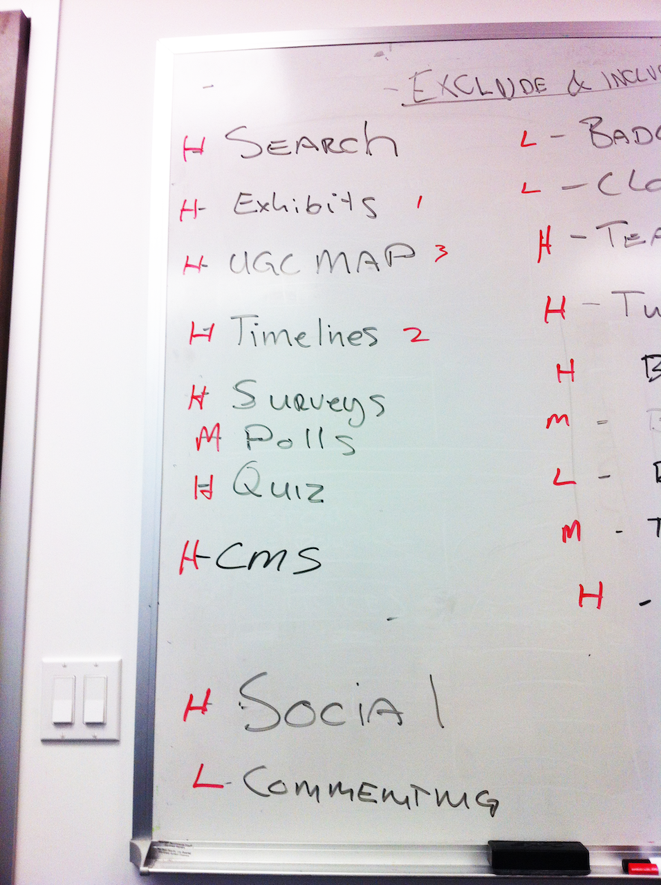
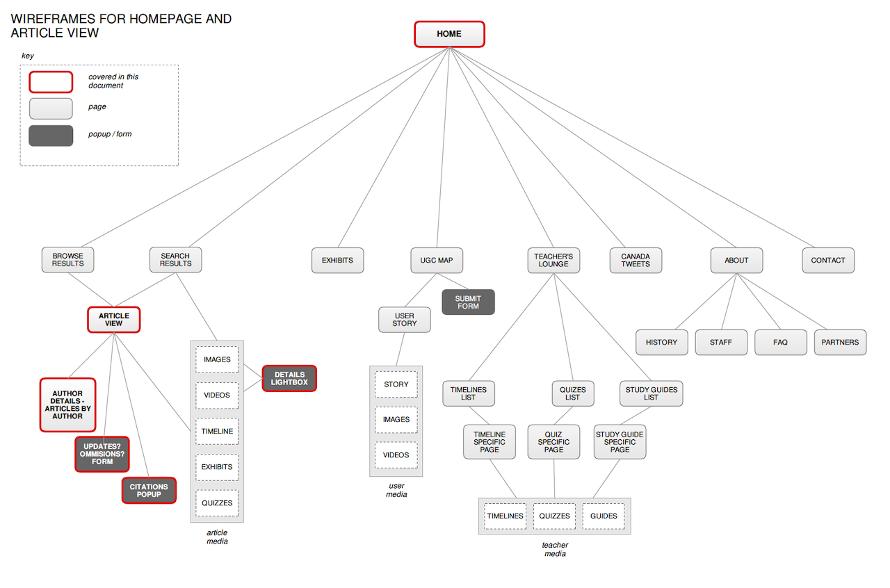
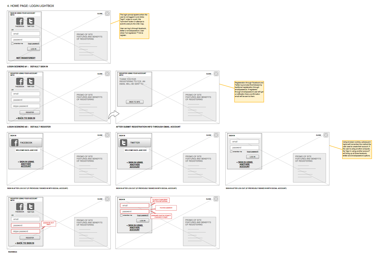
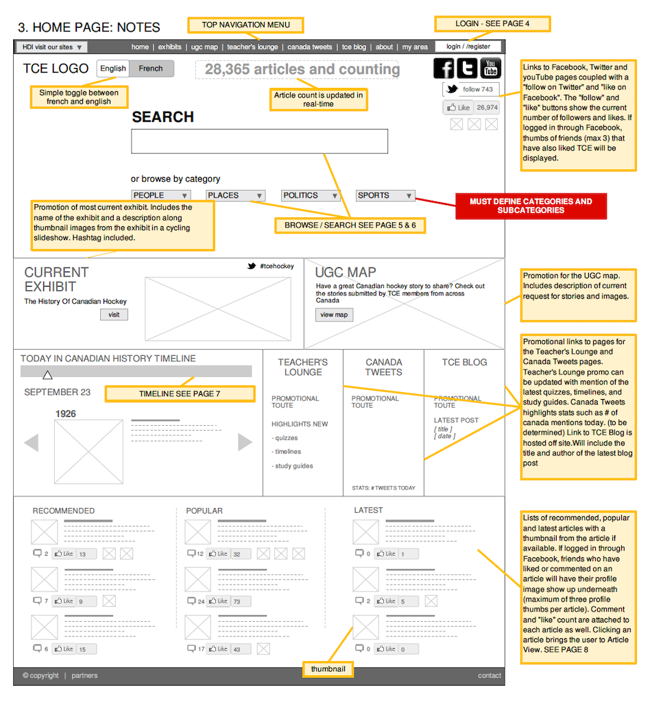
WIREFRAMES & SITEMAPS


SEARCH STRATEGY
The main challenge I was tasked with solving was to find a much more effective way for users to discover what they were looking for while also enticing them to stay with equally exciting and related materials. Historica Canada had an archive of thousands of resources, but the open architecture they had adopted meant that much of the information was being overlooked. They needed a simple solution that linked this content together in the backend. I settled on a smart search strategy placed front and center big and bold with ample white space. Foregoing the standard contextual menu that lists results, I instead had the designers blur the background image and place the results on top. The resulting output seemed much more enticing and welcoming. This bold, innovative search component


- offered suggestions based on what you typed (increasing efficiency)
- offered up the latest articles based on keywords (increasing relevance)
- reminded you of keywords you recently searched for (decreasing repetition)
- marked the content by data type (article, exhibit, quiz, collection etc.)
However, what works well for most users does not always work well for all. Some people prefer a more passive approach to find information, especially if they don’t know exactly what they are looking for. To meet the needs of this subset of users, I complimented the search bar with some high-level browse categories. Browsing by category is perfect for the user who is in more of a research mode. Think of a first-time visitor who just wants to get more acquainted with a broad topic. These people have many questions on their minds and may not know what keywords to use to get the correct answers. A browse UI sets them off in the right direction.
MOBILE DEPLOYMENT

Unfortunately, the mobile strategy for this project was a phase 2 priority for the client, but we did eventually get there. Ideally, we would have just started with a mobile-first/responsive project approach, but that wasn’t an option in this case. By the time we implemented mobile, the desktop/tablet experience had already been deployed. We focused on a smartphone-specific custom layout that would deliver the best experience for the user.

I will note that while not the most efficient or cost-effective strategy, building out a custom smartphone deployment did have some advantages. We could really get in there and tweak the styles and not worry about everything elegantly collapsing. In fact, it was much more akin to styling a mobile app. Menus and profile panels were built to slide elegantly out from the side, pushing the main screen off to the side and allowing the user to never feel like they had suddenly been taken out of the experience.
EDUCATIONAL INTERACTIVES
