Fun WIth Figma
Gold Three Movie App
Concept • Visual Design • Wireframing & Prototyping • Design Library • Typography
What’s the buzz on AI and these cool new Figma features?
As 2024 began, I felt compelled to explore all the latest Figma features and AI toolsets available. This was my first case study not tied to a real project, giving me the freedom to explore and have fun. While optimizing design systems might not be everyone’s idea of a good time, I really enjoy it. I’ve been building design systems for years, and it’s been a valuable use of my time. Let’s see how easily I could create a simple prototype using new AI tools and the latest Figma features.
This one is for the love of movies
During the holidays, I watched a bunch of movies, and I came across some cool indie films from A24 studios. A24 has grown their brand by attaching their name to film auteurs and using social media and gorilla style marketing to grow their brand several Oscars later, they have proven their formula works. I got inspired to imagine my own film company, Gold 3. Why Gold 3? Well, I just thought it sounded kinda cool.
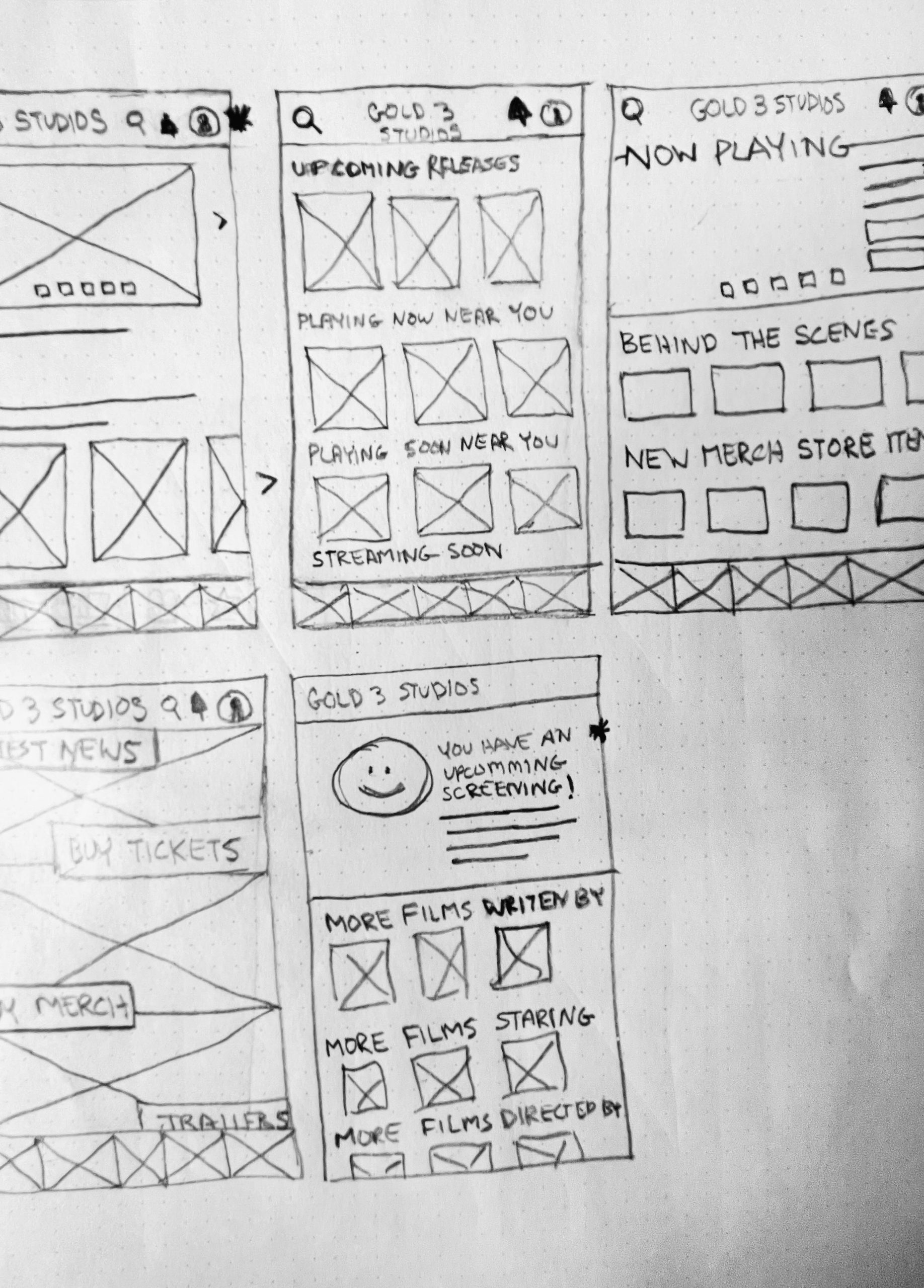
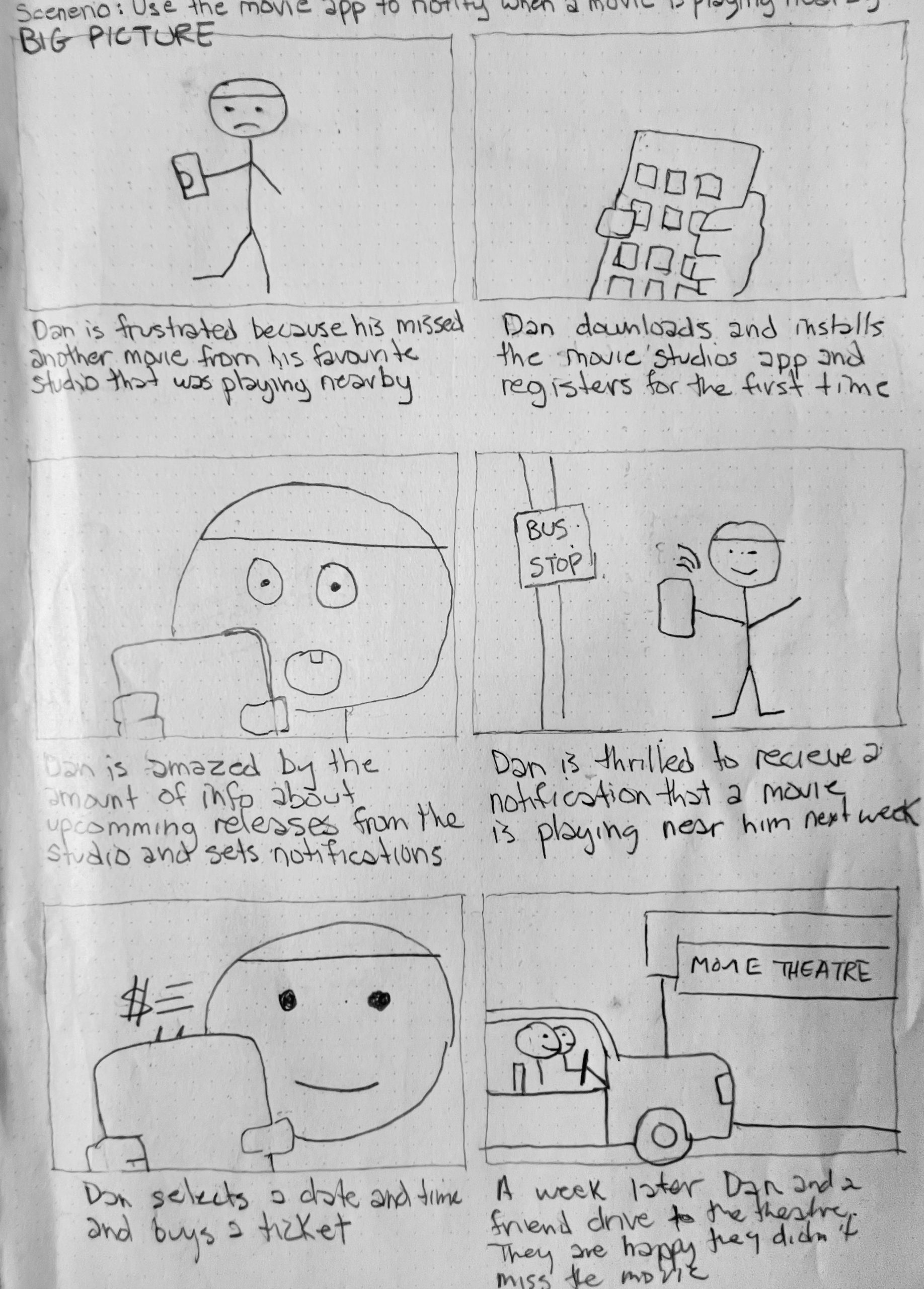
In this imaginary scenario, Gold 3 Productions would create an app to promote the culture and ideas of the films they release. The app would have exclusive interviews, behind-the-scenes merchandise, notifications for ticket sales, and other cool features. The app would appeal to those whose identity is locked in with the movies they produce. I soon began sketching out some ideas.
Slap a quick logo on it
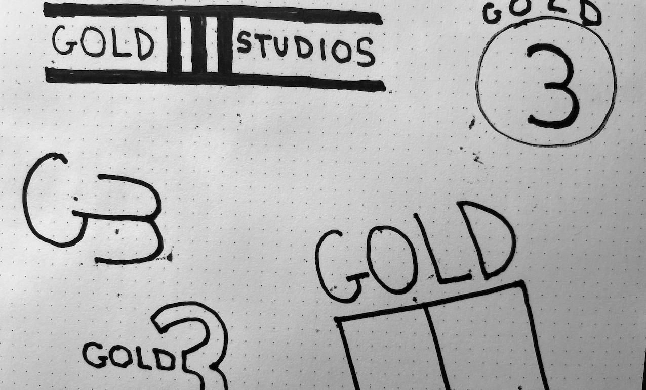
So, it seems like everyone and their dog is buzzing about the groundbreaking technology that is artificial intelligence, right? It’s undeniably a big deal. But, my attempt to use it for creating a logo didn’t quite hit the mark. Maybe it’s my own limited AI experience, the usual hiccups in early-stage tech, or a bit of both. In the end, the AI output didn’t really spark any creative ideas, and I found it way faster to whip up a logo on my own. Quick, dirty, get it done. AI would have its moment to shine in the next stage of the design.

AI: Robot army destroys Lorem Ipsum and stock images
After spending years building wireframes and prototypes, I’ve often had to decide what to include for early stage content. For wireframes, it’s usually enough to draw horizontal lines for text content. In early prototypes, the go-to has been using Lorem Ipsum as placeholder text—it looks like written text but doesn’t actually mean anything. It’s a quick fix, but it can make prototypes read as fabricated and uninspired. Now, with AI tools like Chat GPT, you can describe the text you want as a placeholder, and it’ll generate something much more contextually fitting just as quickly. In my prototype, the article was 100% AI-generated, and even though it’s just a placeholder, it reads quite authentically.

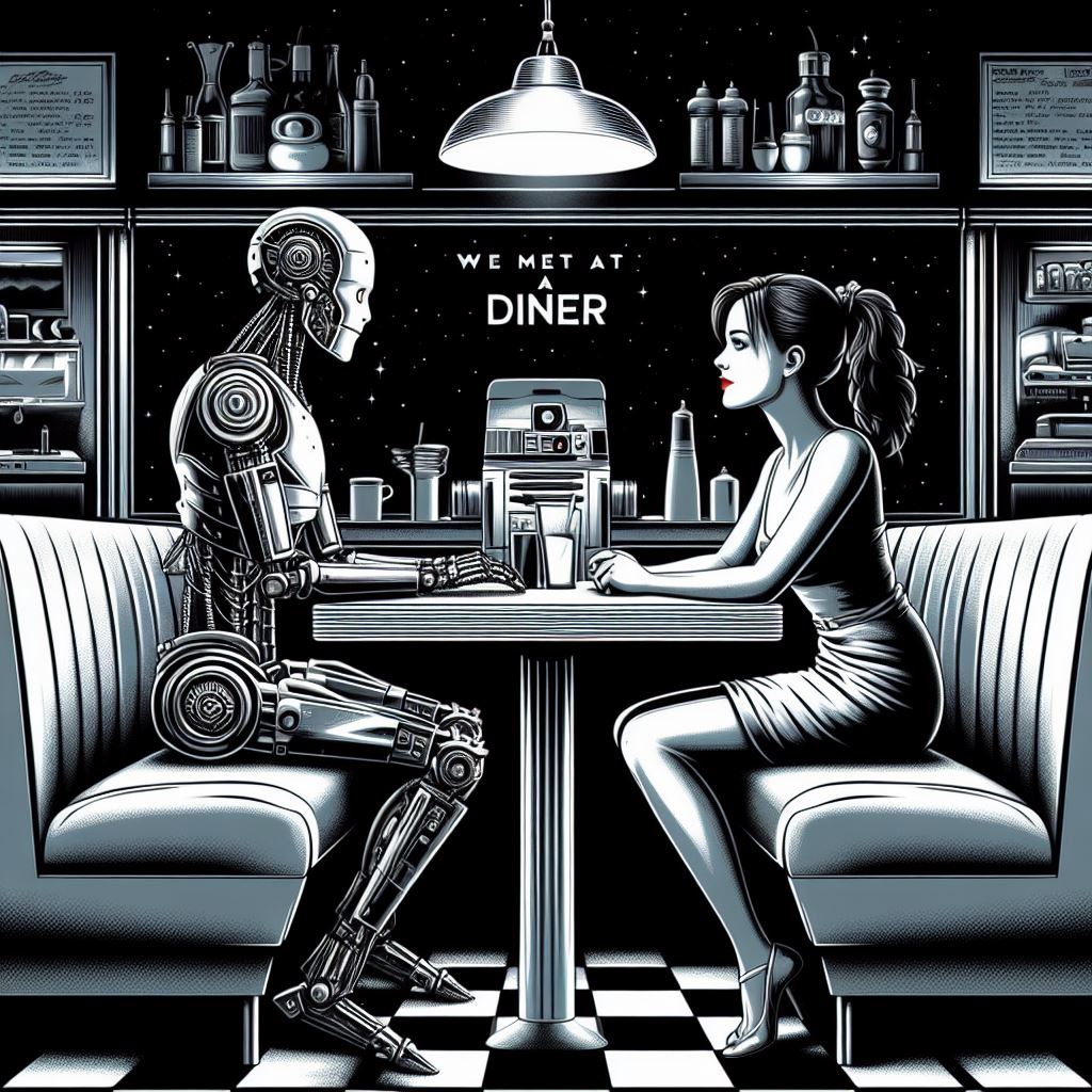
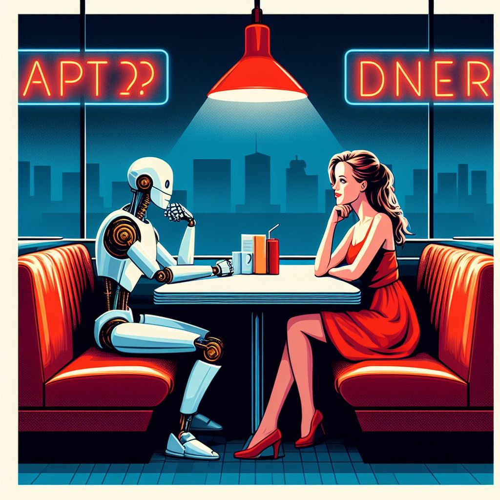
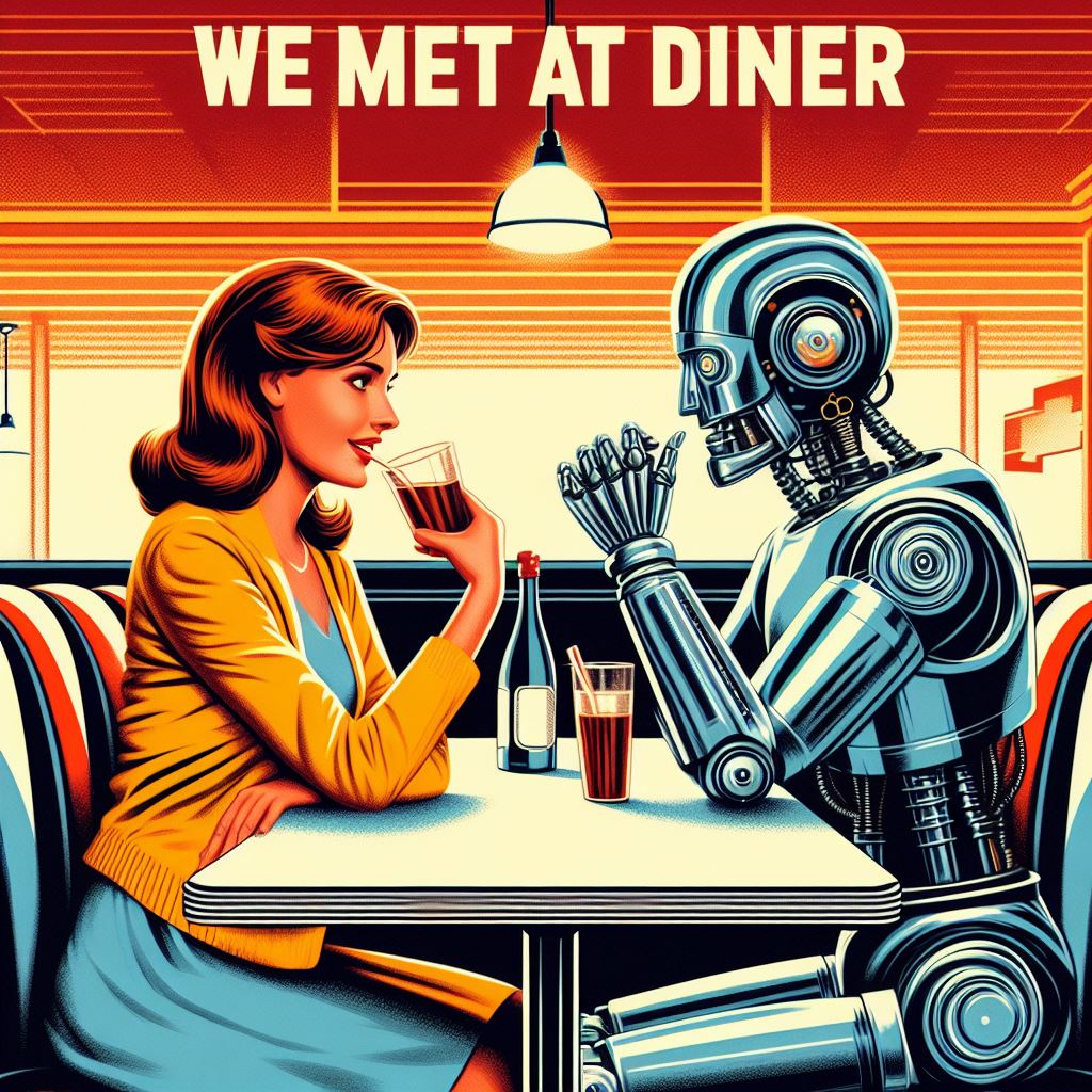
Next, I tried out graphic generation AI tools like Microsoft Image Creator to create the article images and movie posters for my project. I was surprised at how detailed I could be in giving design instructions, making my conceptual app look just as I wanted. People discuss a lot about the good and bad sides of AI in design, and those conversations are important. But, when it comes to generating options and quickly putting together initial concepts, many of these tools can be useful for creatives to kickstart their ideas fast.

A real time type saver

I always start my designs with a single font family and type scale. I chose Barlow for the font family as I found it sophisticated but also friendly. I generated the type scale using a ‘new to me” plugin appropriately called Typescale. With this plugin, I was able to play with a range of font families, weights and spacings until I found a combination that worked. It made making type changes a breeze.
Let’s component-ize with variables!

My favourite aspect of Figma is just how easy it is to create components. As this was a small, personal project, I kept things simple and created components for buttons, icons, toolbars, navigation and date pickers. Most if not all of these components made use of Figma’s auto layout features. To size these components, I used the new number variables to set the padding and margins – allowing for small, medium and large versions of the components without needing to duplicate the assets. This would make handing off scalable designs to developers much easier as they would have access to all the sizing measurements.
Add a splash of colour
As the concept of Gold 3 revolved around a community of film lovers, I wanted the design to feel warm, welcoming and alive. Over the past few years I’ve been relying on mood boards and images as a means to extract colours for design styles. I stumbled across an image of a sun setting on a beach that invoked the feelings I wanted to mirror in the application. I very much loved the resulting colour palette.


Quick & easy dark mode

I already made use of variables to store number values for the different component sizes. We would do the same for colour. By storing colours as variables in a database we can attach the same colour in a number of different variables names making them much more flexible than colour styles. More impressively, these variables can be stored in a Figma table where the variable value can switch depending in what column or “mode” it is in. Using this flexibility, I was able to create a completely separate dark mode using only variables and without the need of any component duplication. The entire process took less than fifteen minutes.

