
Proposify
Global Styles & Formatting
MY INPUT
Customer Interviews • Analytics & Data Tracking • Research • Wireframing & Prototyping • User Experience • Product Iteration
Proposify is a growing SaaS company that empowers its users to close business deals faster. I’ve spent the past few years working at Proposify, where I’ve optimized customer workflows based on performance, expectation and overall user experience.
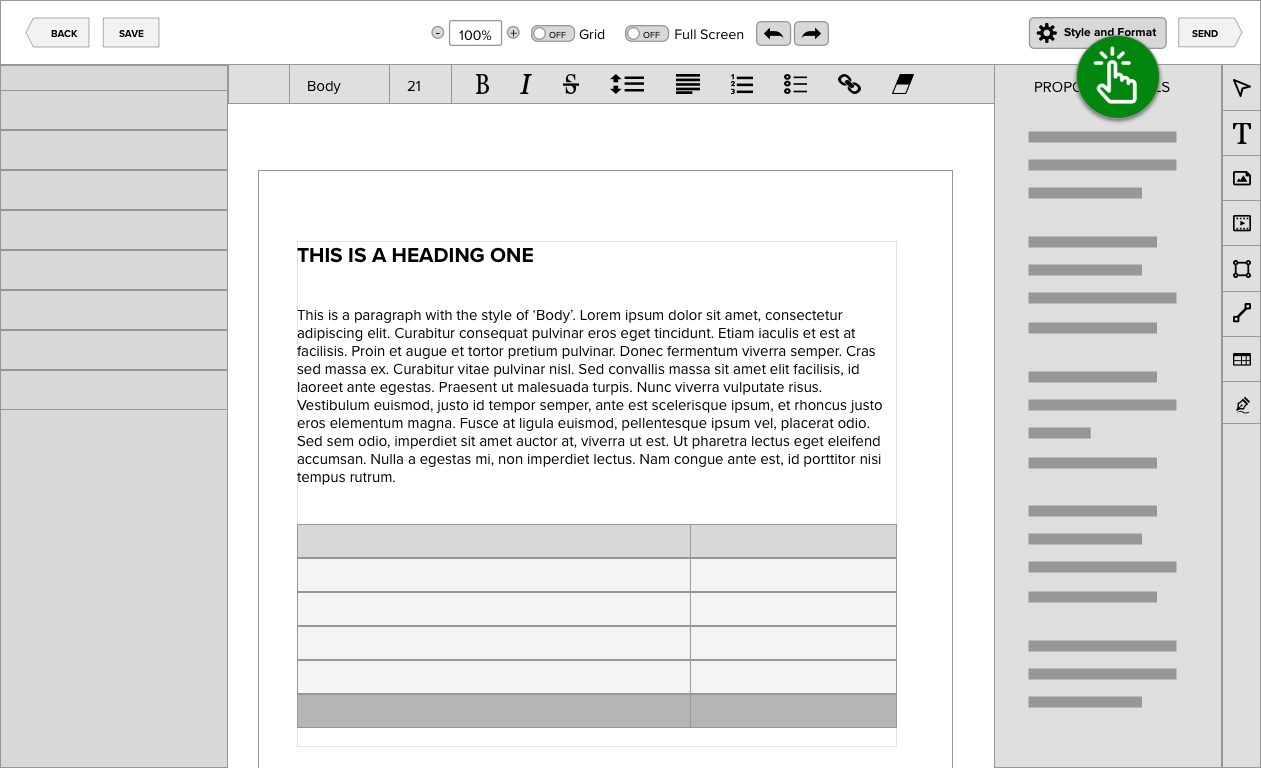
Among the many features, Proposify provides, the most popular is its powerful document editor. The following case study highlights when the editor’s styling tools were not meeting customer expectations. These concerns posed an exciting challenge as the editor needed to be accessible to designers and non-designers alike. Let’s take a look at the problem in more detail.
CUSTOMER PROBLEM
“Why is my f#cking [element] the wrong colour?”
If my time at Proposify taught me anything, it’s that sales reps need all the time they can get; from drafting a sales document to sending it to getting the close. Any time required to edit documents risks giving an advantage to rival bidders or – even worse – letting an opportunity wither on the vine. Customers attempting to switch their pull quotes from ‘hot pink comic sans’ to a more conservative style will soon churn if they can not do so quickly.
It was precisely these types of design hiccups that caused increased frustration with some Proposify creators. Questions like ‘How can I change the colour of all my table rows to blue?’ or ‘Why don’t my headings match across the page?’ started flooding the support lines. An answer was needed: Why were these customers having such a hard time performing straightforward style changes?

THE RESEARCH
I quickly focused on hearing the perspectives of the very people experiencing these problems. At the same time, I needed to check if the site analytics revealed any clues to the source of their pain. This is what I learned:
- Customers with little design application experience had difficulty understanding the difference between spot styling and global styling.
- Legacy knowledge of MS Word or Google Docs helped, as these users were less likely to contact support concerning styling issues.
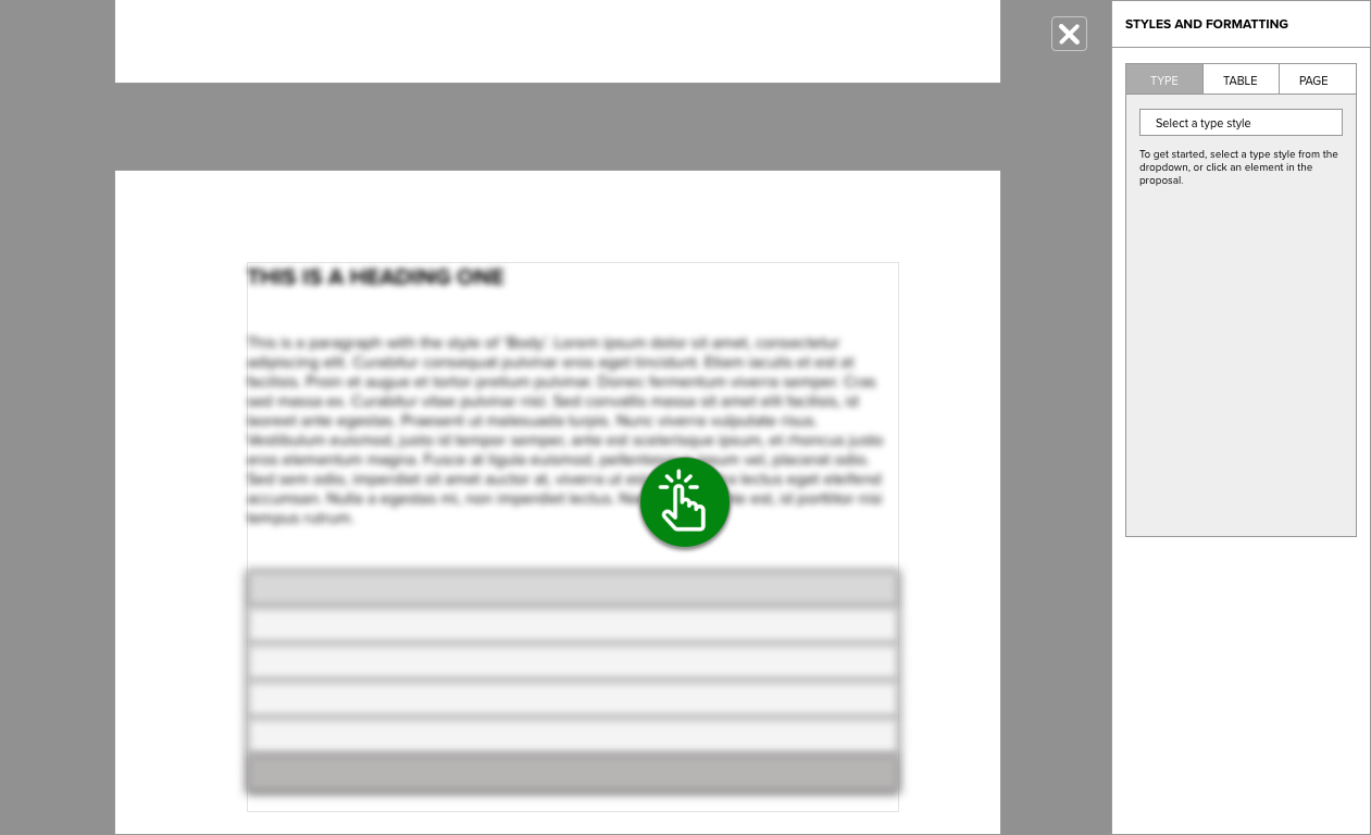
- Access to global styles was hidden amongst all the other styling UI elements. Is this why it wasn’t being used or did customers simply not understand the concept? Something to explore in the prototyping phase.
- Using Heap Analytics tools, I discovered that over 60% of users never selected the global styles dropdown menu. Yikes.
- Instead, users chose to apply spot style edits to each element they wanted to affect. This method proved very time-consuming, especially in scenarios where future style change requests were inevitable.
- Users that used global styles over spot styling spent an average of 36 fewer minutes in the Editor from proposal created to proposal sent.
Finally, from the customer’s perspective, the concept of style formatting was not as relatable as a plain description of the styled content. For instance, a user was more likely to describe a style as“the yellow About Us part” over the less descriptive Header 3 label. The actual content played a pivotal role in understanding style.
WIREFRAMING & PROTOTYPING

PRODUCT SOLUTION
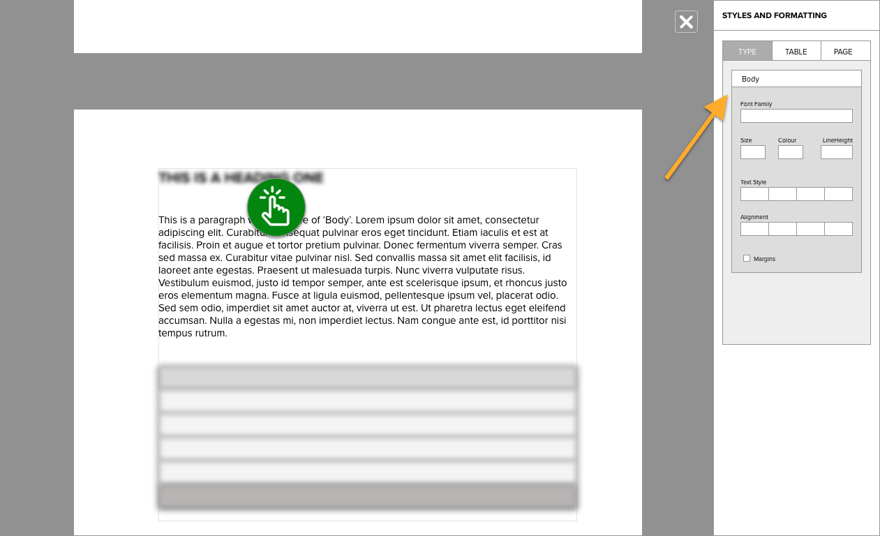
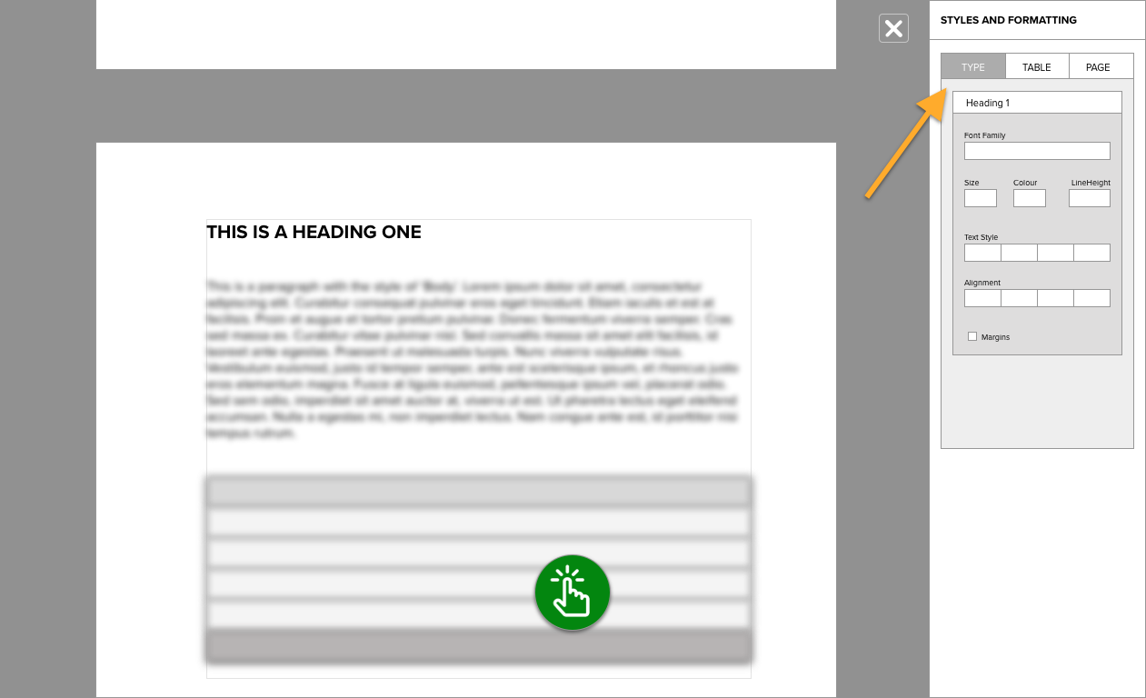
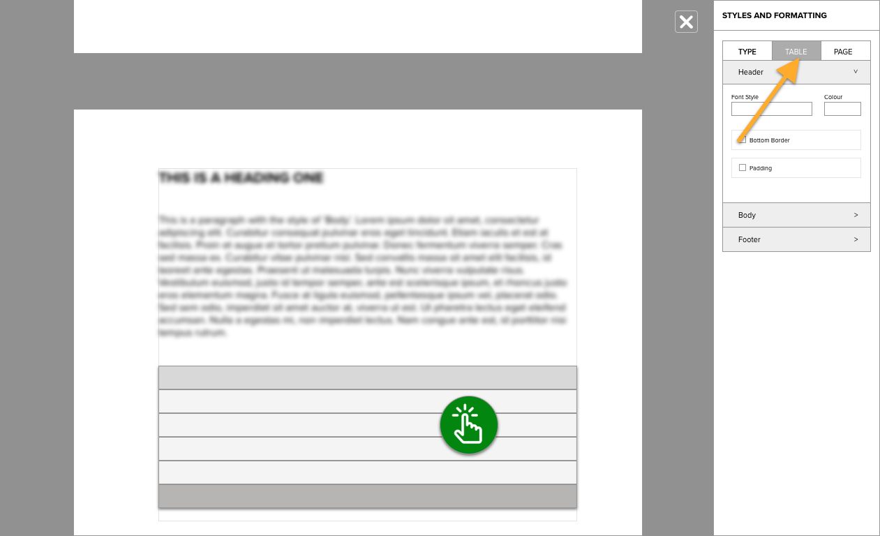
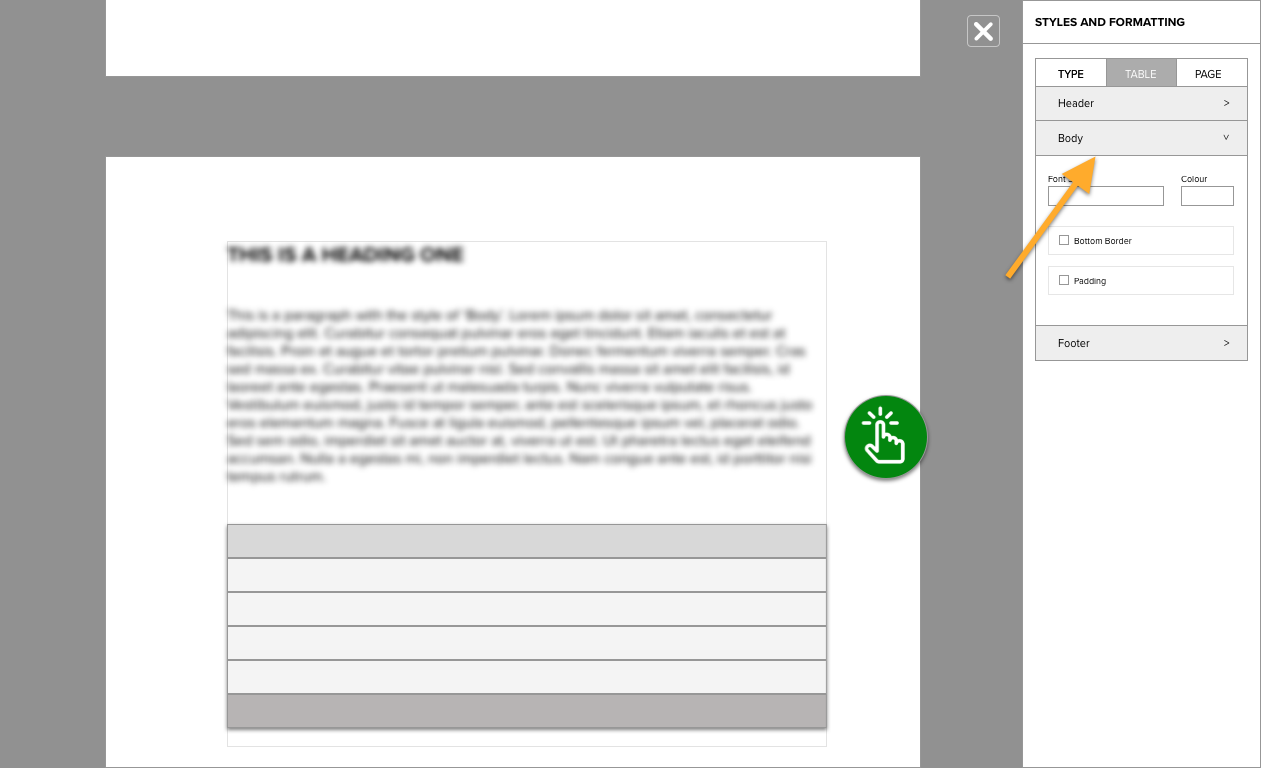
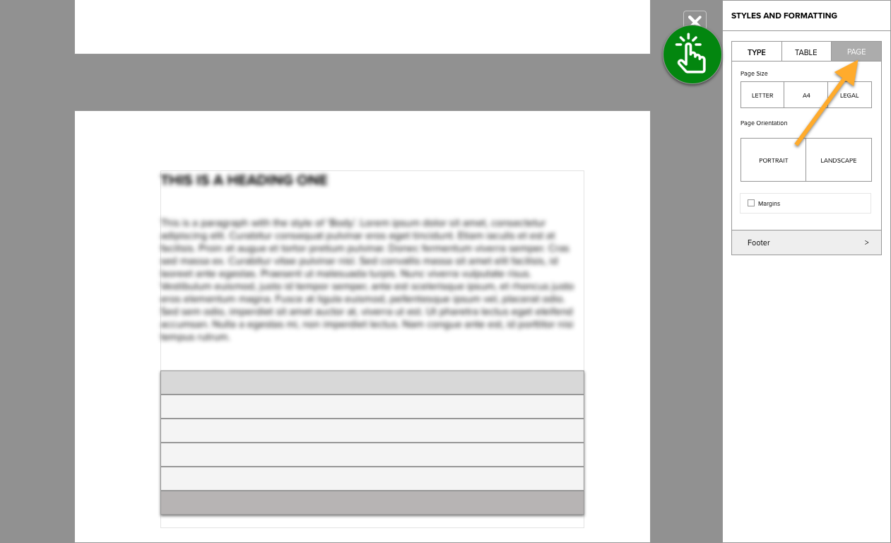
The solution was simple: if users had difficulty understanding the connection between styles and content, empower them with a new way of viewing the relationship. We called this new perspective global style mode. Content creators were free to click anywhere in the document when in this mode to see what styles were currently applied. Everything else was faded and blurred.
I pictured the current document editor with a thin sheet of tracing paper placed on top. In this new view, all document content would visually recess into the background. Users could then give focus to specific elements by simply clicking on them. Upon selection, any styled element – a paragraph, heading, list etc. – would visually rise into focus along with any other elements sharing the same style. The user was then free to scroll the document or select the next and previous buttons to view how the currently selected style was applied throughout the document.
Q: Want to know the style of a header?
A: Click on it to find out.
Q: Why does the look of my headers also change when I edit my list styles?
A: Click on them to find out
The global styles removed any ambiguity about how a user’s content was styled and structured. The associated style properties panel updated with every selection, ready to facilitate any user’s style change.
RESULTS & FINAL THOUGHTS
- The use of global style increased by over 30% within the first month of release.
- The average number of monthly support tickets with the ‘style issues’ tag decreased by an astonishing 65%.
- The feature was expanded upon with additional capabilities for global styling tables and page layouts.
- The average amount of time spent in the editor from proposal created to proposal sent decreased by 7 minutes.
- The project served as an essential product management lesson to always keep the customer perspective in full view.