BUK
Social Food Discovery
MY INPUT
Creative Roundtable • Research • User Experience • Wireframing & Prototyping • User Flows • Onboarding Strategy • Search Strategy
Buk was an R&D project for a food discovery platform aimed at making restaurant selection more contextual. I was tasked with evaluating the current build of the product and offer strategies that would improve the overall user experience.
As with any project, I started with research and analysis. I was tasked with looking up and evaluating similar services, devising strategies that would set the product from the competition, and assessing third-party APIs that may extend the service’s functionality. The research effort was extensive, generating client confidence that no stone was left unturned.
SKETCHES & WIREFRAMES
After completing my research, I grouped up with some stakeholders and started whiteboarding strategies that might generate a better user experience. Users were getting lost with all the options and levels of functionality. I convinced the client to envision the product in a “mobile-first” view limiting the initial thought to only those functions and UI elements that were necessary. Convincing a client to scale down a product is never easy, but this service was far too robust and unruly. The product needed to be simplified to regain its original purpose.
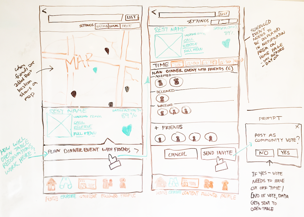
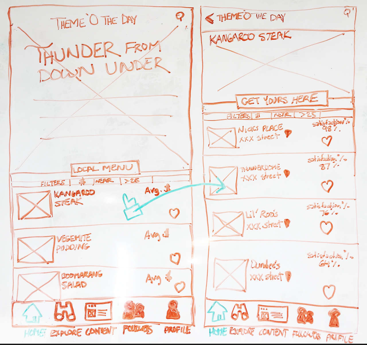
By the time the consultation meetings were over, the designers had already mocked up many updated graphics and UI elements. With these assets at my disposal, I started wireframing new layouts that were much less cluttered. Usually, I like to use more disposable, low-fidelity wireframes but as this was an existing product, having finished graphic elements helped better convey my ideas to the client.
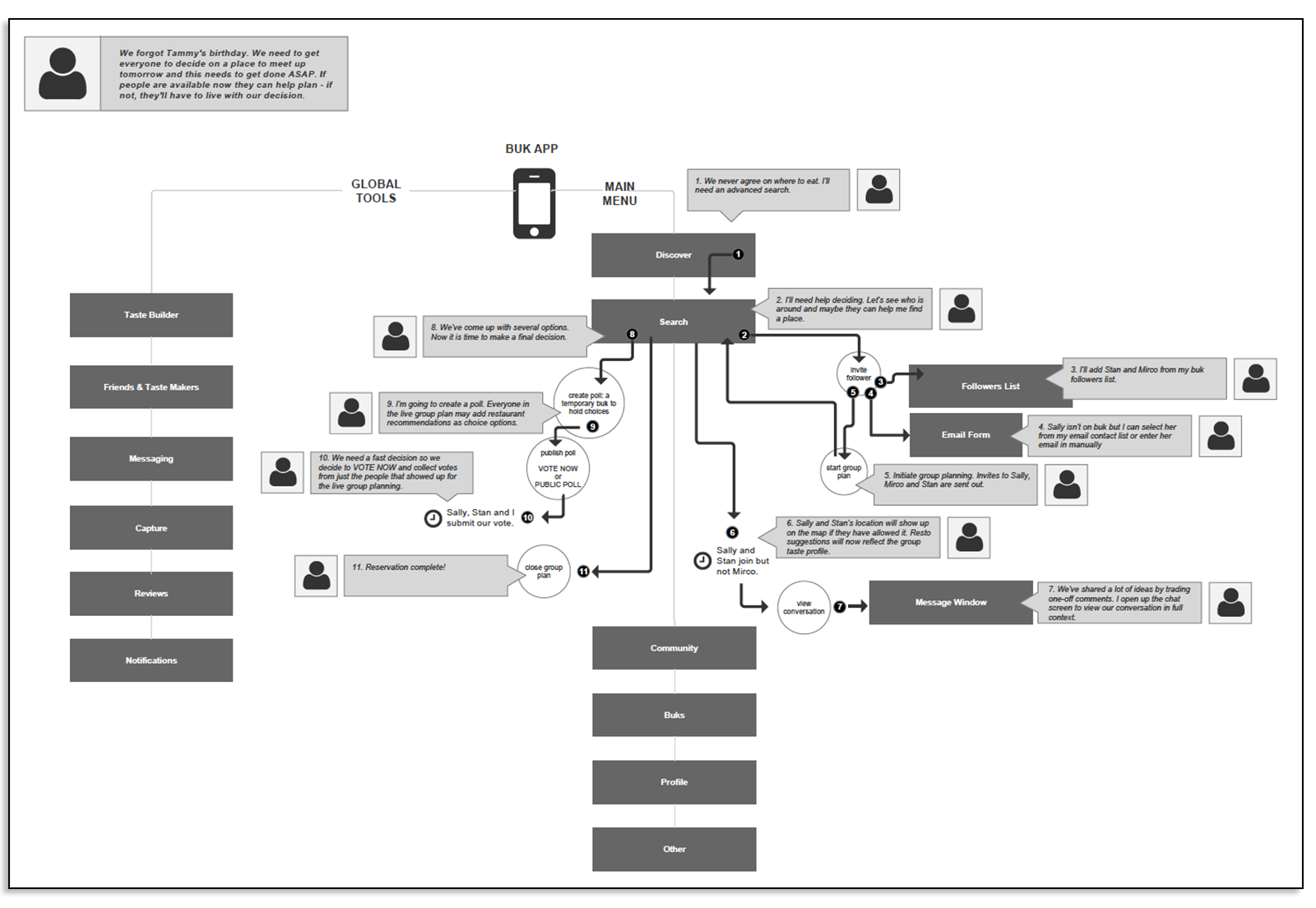
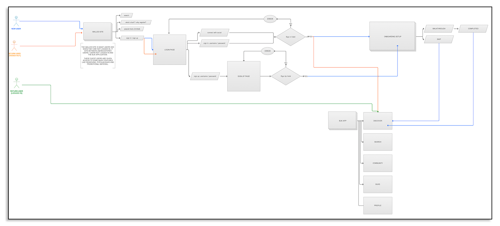
USER FLOWS & STORIES
A good percentage of my user experience work is editing down to the essentials. It is not my mandate to create user experiences that are particularly innovative or sophisticated, creating competition with creatives when none need exist. The UX I strive for is invisible and frees up creativity to do best while establishing an underlying theory that is never obvious to the user.
The client also had difficulty collecting user data, a vital ingredient (pun intended) for a food service that matched people to their favourite foods. The more information the system had upfront, the better results they could calculate. We came up with a simple onboarding system that provided positive reinforcement as users submitted information. It was crucial that at each step, the reason why this information would improve their experience was clearly communicated. Secondly, a large skip button was provided on every step along the onboarding process, so the user never felt pressured or trapped.
SEARCH OPTIMIZATION


MOBILE STRATEGY
